MathWorks Annual Report
Client: MathWorks
Role: Art Director, Design Lead, Illustrator
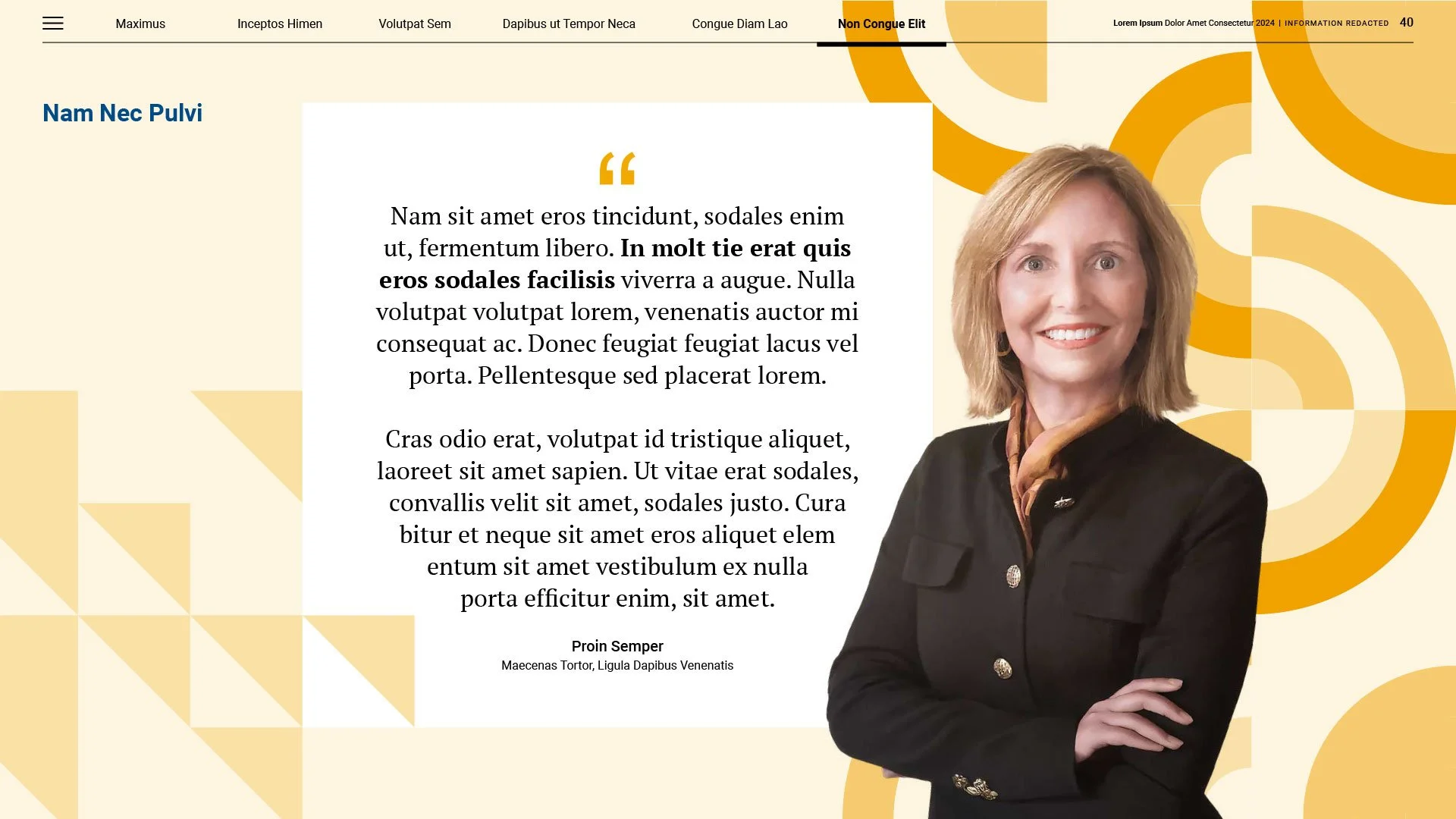
I led the creative direction and design of MathWorks’ inaugural Inclusivity Annual Report, setting the visual and strategic foundation for company communications regarding representation and employee engagement. Our goals were to showcase the company’s commitment to fostering a culture of belonging, highlight meaningful progress, and celebrate key initiatives. The design served not only as a reflection of our shared values but also as a central hub for ongoing and future community-focused efforts.
Note: All content in the report has been redacted for confidentiality.

Client Alignment
I spearheaded initial creative brief discussions to ensure alignment with senior leadership on the project's creative direction. Through these discussions, I learned that the team wanted the final piece to be bold yet maintain the core brand identity.
Concepting, Art Direction, and Design
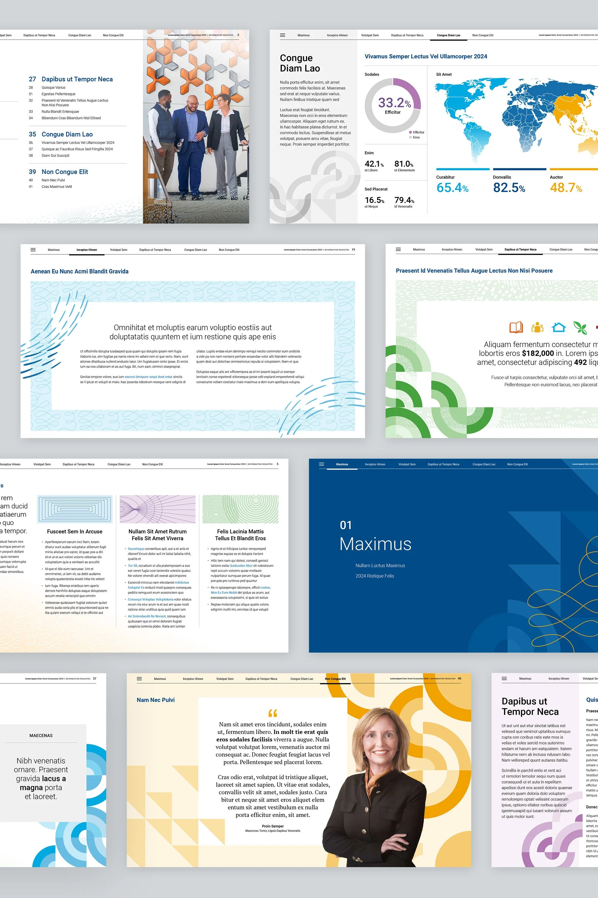
After conducting a comprehensive industry benchmark analysis, I developed several concepts and visual directions. I then provided strategic support to the team, offering high-level guidance on photography and creative approaches for visualizing content and key data points. Ultimately, my goal was to strike a balance between boldness, brand authenticity, and demonstrating equitable representation at MathWorks.
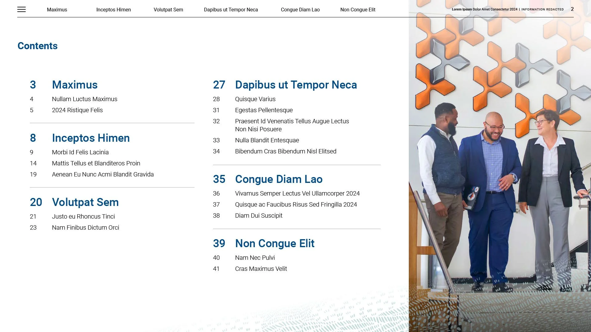
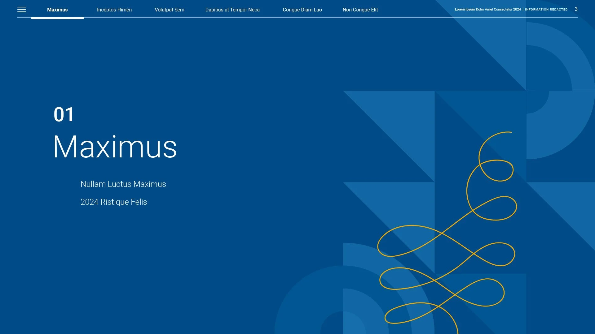
Interactivity: Since this document was intended for digital consumption, interactivity played a central role in its design. Clickable elements were seamlessly integrated throughout, including:
A consistent top navigation bar on every page
Interactive divider pages
A dynamic table of contents
Hyperlinks to relevant information and sources
Style Guide
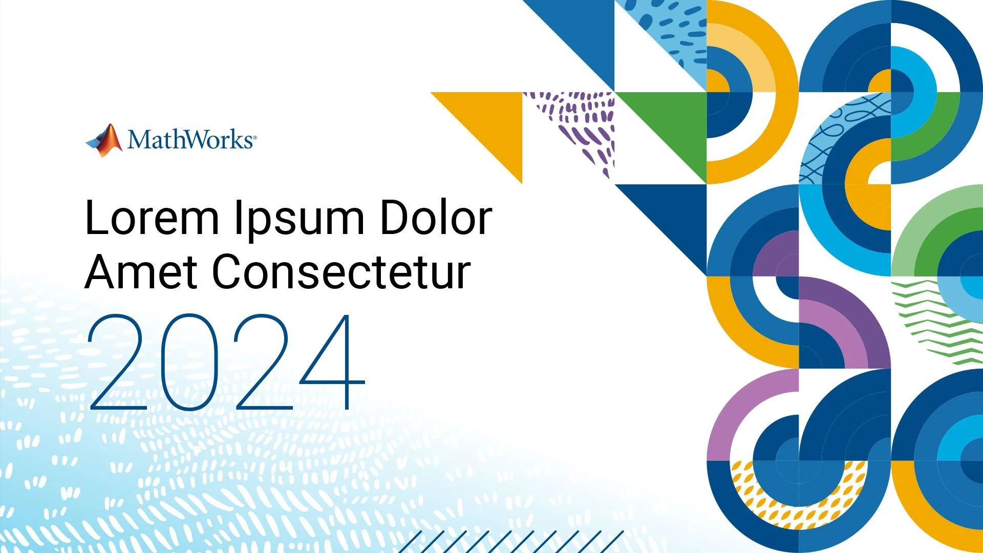
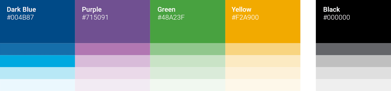
Color
I developed a comprehensive and versatile color palette that enhances visual impact and brand recognition while aligning with MathWorks’ brand guidelines.
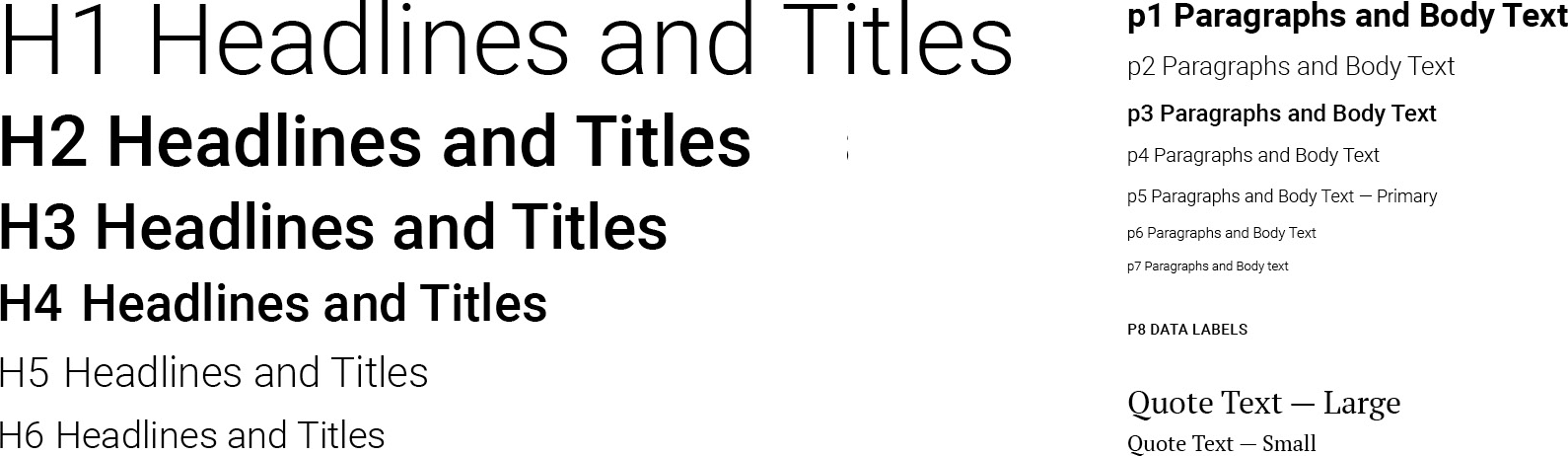
Typography
I assembled a flexible typographic system rooted in the Roboto font family that reinforced the clean, sophisticated aesthetic I aimed to achieve while supporting a modular approach to page layouts.
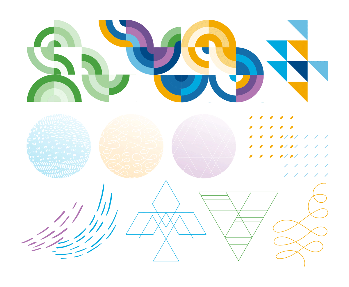
Illustrations and Patterns
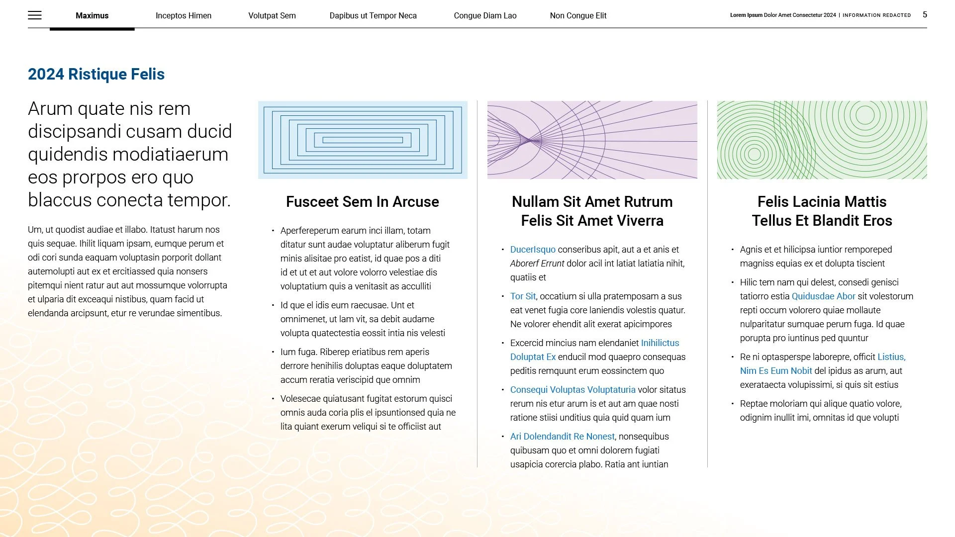
Through an abstract lens, the interplay of shapes, colors, and textures—along with their moments of connection and disconnection—visually represents the complexity and richness that individuals contribute to any project or initiative. The variety of design elements introduces an organic, dynamic quality that serves as a visual framework that uniquely supports the organization’s needs to activate the brand across future initiatives.